Strengthening the brand through meaningful, consistent, and cohesive design
My Impact:
Sold the value of developing a design system and worked to educate and persuade engineering and product partners to prioritize the work to collaboratively create a design system to enhance consistency across the digital experience and increase efficiency across multiple teams.
Led the creation of Taco Bell’s first digital design system through partnership with the engineering team leading work on tokens, components, design standards, documentation, system structure and process.
Set the vision and strategy ensuring execution of a robust and flexible system enhancing efficiency for both design and engineering teams and freeing up capacity to focus on more strategic design challenges
Hired, organized and oversaw a dedicated team to ensure the design system was well structured to create a shared foundation for digital design across the business.
Ensured accessibility in the system through adherence to WCAG standards and testing within the system and with appropriate audiences to ensure a foundation for accessible design
Planned for scalability with initial focus on the mobile experience and next steps to expand the approach to create connected systems across all digital channels (web, kiosk, digital menu boards, etc.)
The goal of the the design system was to enhance the aesthetic appeal and create a cohesive, accessible, and scalable design system that supports Taco Bell across all digital channels.
The framework empowers the design team with a unified vision and a practical toolkit, establishing a digital-first approach that reflects Taco Bell’s brand values consistently and effectively.
I oversaw the team’s work on:
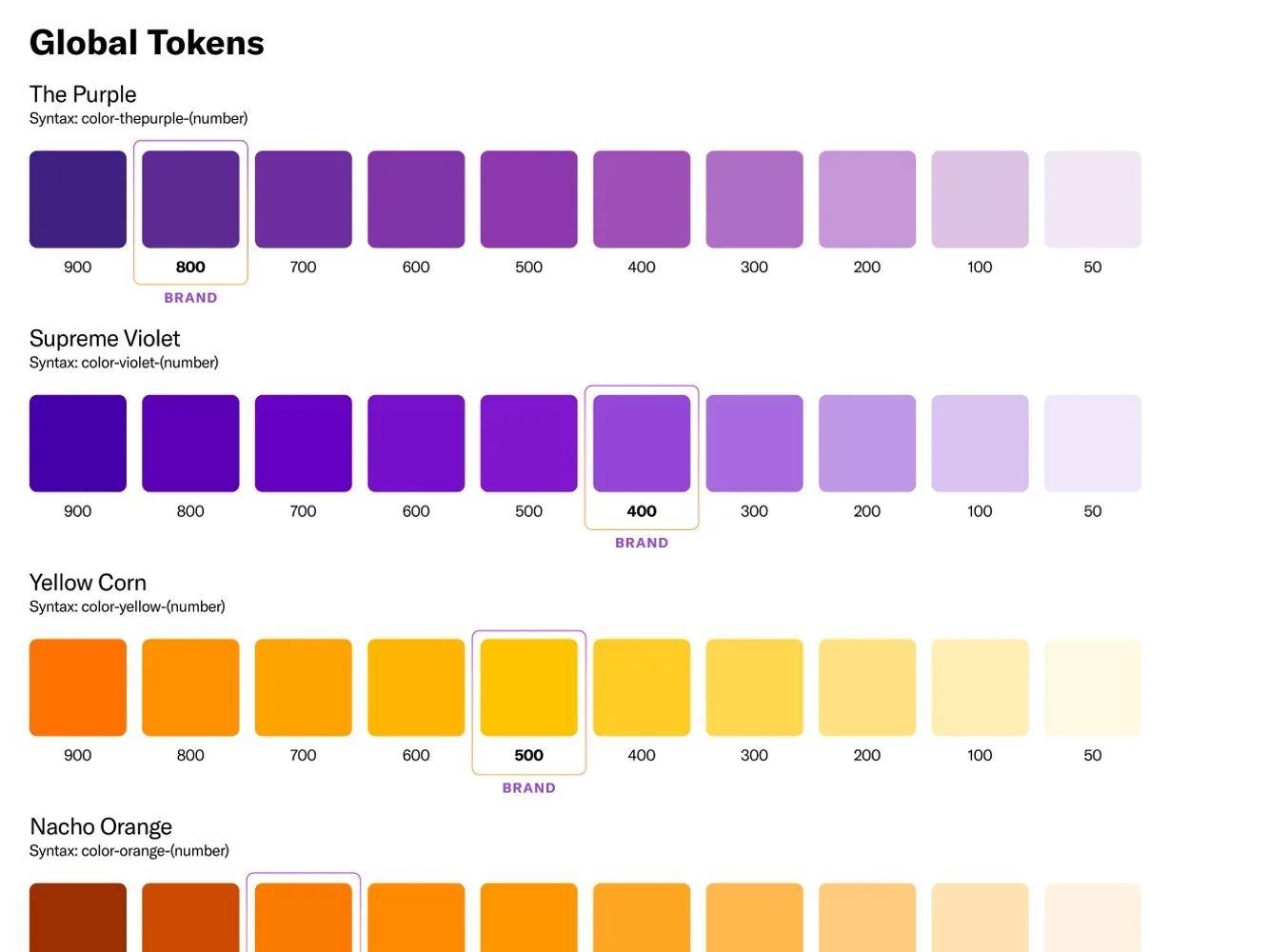
Base Palettes—covering color, brand, functional, and neutral tones—ensuring that our brand identity remains clear and cohesive across all touchpoints.
Semantic Colors used for background, foreground, borders, and accents to bring clarity to the visual language of our UI, aligning with contrast consistency and accessibility standards. Structured a typographic system defining Fonts, Styles, Hierarchy, and Logic to achieve clear communication and a strong visual flow.
Spacing principles were meticulously outlined through grids, logic, and tokens to maintain harmony and balance throughout layouts.
Depth guidelines, such as elevation styles, shadows, and focus indicators, were added to convey interaction states effectively and enhance the user experience. Defined Borders (radii and width specifications),


